Postcards & Mailers
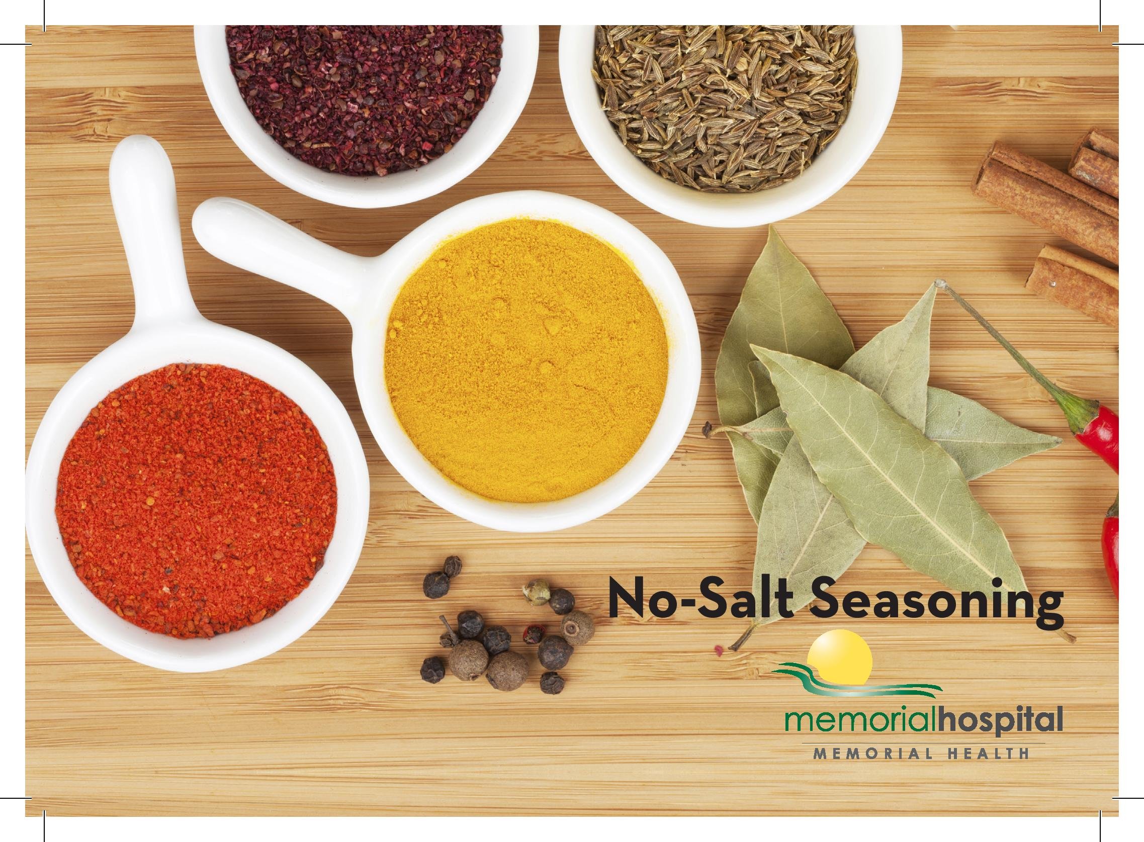

No-Salt Seasoning Recipe Card
This 7x5 recipe card was created for Memorial Hospital of Jacksonville as part of their cardiac health educational material. The design used white space and light colors for high visual appeal and to better make the colored spices “pop” on the page. The photos are stock art from Getty.
The design was built in InDesign using MHJ’s CMYK brand colors. The card was printed digitally inhouse and distributed as a stand-alone piece and as part of a larger cardiac health package.


Bay Area Tree Service
This was a 5.75x4 postcard for a Tampa-based tree removal service. To reflect the natural nature of the customer, a heavy green color emphasis was used. The customer had no photographs to supply, so clean, professional stock landscaping imagery was used. The card was built in InDesign, using background elements built in Photoshop. Vector art, such as the gold discount plaque and the Super Guarantee logo, were built in InDesign itself. The card was distributed as part of a package of postcards as well as provided as a stand-alone mailer, with a layout in compliance with postal regulations, and includes the postage paid indicia and an area for a return address.


Josie’s Grab & Go
This Virginia restaurant wanted a clean modern look for their card, with a heavy emphasis on a wide variety of quality meals. Eight stock images were selected for both front and back of this 5.75x4 postcard, and the message was kept simple, leaving the name and the images as the dominant elements. The card was part of a bundle of advertising cards, so was not set up as a self-mailer. The photographic backgrounds were set in Photoshop, while the text and glow effects were in InDesign. The card itself was printed on cardstock, with the front in gloss and the back in a matte finish.


Taste of Punjab
This Indian restaurant sought a clean, classical 5.75x4 postcard that worked as both an ad for their grand opening and as a coupon. I began by building the background, combining a light stucco texture with an overlaid vector map image of the Punjab, India, area, then completed the effect with a multiply layer to add shadowing effects. Stock images of traditional Indian cuisine were then added. I used softly beveled gold lettering for the customer's name, to convey a sense of elegance and refinement, and followed through with a light gold and tan color scheme for the remaining text. This also worked to complement the browns of the background image. Brighter reds and blues were used in the coupons on the back to better help them stand out. All work was done in InDesign and Photoshop.
Clearview
A "sparkling clean" motif was extensively used in this ad for a pressure washing and window cleaning service. This 6x4.75 card was designed as a postage-paid mailer, and the back was built in accordance with postal requirements. The customer's name was given a clean glass-like appearance, which was further emphasized with the addition of sparkles. Soft blues were chosen as the primary color scheme to further emphasize the "clean" nature of their business. Layout was done in InDesign, with background textures tweaked in Photoshop. Vector elements, such as the "sparkles" and the gold discount plaque, were built and placed in InDesign.


CTL Lawn Care
This 5.75x4 card uses the same core template as the "Bay Area Tree Service" card. We often used this technique to improve our productivity, without sacrificing quality to the customer -- it was important to keep track of where the customers were, of course, so that the same style card would not be duplicated in the same advertising market. And, despite being based on the same template, I always tried to "mix things up" enough to give each a more unique appearance.
For CTL, the emphasis was on lawn care, so a selection of stock lawn images were used on the front. On the back, their three separate discount offers were separated and highlighted individually. The card was built in InDesign, as were the vector elements, such as the Super Guarantee logo and the gold plaques. Photoshop was used for the front imagery.

Texas Roadhouse
This steakhouse wanted a card that emphasized their low "Early Dine" option and its low price, and so it became the dominant element on the card. I selected a more rustic serif typeface and paired it with an antiqued paper background to give the ad more of an "Old West" feel. The customer provided both their "Texas Roadhouse" logo and the "Call Ahead" logo, and I chose the stock images of steak meals. Both sides of this 6x4.25 postcard were printed with the same art, and it was distributed in a package of postcard-style ads.


Duff Insurance Agency
A clean and professional modern image was the goal for this customer's 6x4.75 self-mailer postcard. For the front, I selected a mix of photos to represent the main coverage options for Duff Insurance. On the back, the customer name is highlighted and the eye is drawn to the free quote offer. I used a blue theme both for it's modern appeal, especially when combined to a clean modern sanserif type, and for it's positive emotional nature. The front of the card was done in Photoshop, with type added in InDesign, while the back panel was entirely build in InDesign.


Villa Tuscanna
Villa Tuscana wanted to capture the essence of a classic Italian restaurant with their postcards, so I used the "Taste of Punjab" layout as a foundation -- the background is the lightly textured stucco with an overlaid shadow layer, and a softly beveled gold effect is used for their name. The customer had provided several photos, and a considerable amount of text for inclusion on their card, so I incorporated the photos into the front design and left it primarily as an eye-catching photographic display to highlight their name and Italian meals. On the back, I presented the text cleanly, using different styles to provide good visual diversification for the reader. I highlighted the key offerings of the restaurant with a gold plaque design, which was built in InDesign.


West Florida Paint & Design
For this Bay Area painter, I began by pulling together a wide selection of vibrantly painted interior and exterior walls. These images were assembled in Photoshop to form the front of the card in a checkerboard style. The caption is from the front is repeated on the reverse of the 5.75x4 card, where the customer asked for a strong red influence. Since the customer had very little text to convey, I split the back-of-card layout into three sections -- at the top is a summary of the customer's offerings, in the middle is a prominently highlighted discount offering, and at the bottom is the customer's name and phone number. The requested red is provided with a dominant art element, a dash of red paint and a freshly painted red floor at the bottom of the card,


T.M. Lucas, Bookkeeping & Accounting
T.M. Lucas wanted to draw upon the frustration that many experience when trying to manage their own books, and so the stock images of a tired man huddled over his paperwork and the confusing swirl of receipts were selected. I selected a somber light tan color to complement the color of the receipts, and then chose a vibrant blue to draw a more positive line of attention to the customer's name and contact information. This was a 6x4.75 postage paid self-mailer card, printed on cardstock with a glossy front and matte back.